Kitchen Colours Ideas That Work for Busy Homes
Key Takeaways
- Your kitchen serves as a central hub for various daily activities in your home.
- The colours chosen for your kitchen should be both functional and aesthetically pleasing.
- The right kitchen colours can influence the mood and atmosphere from morning to evening.
- Colour choices in the kitchen can enhance the overall feel and usability of the space.
Table of Contents
- Understanding Kitchen Colour Psychology
- Popular Kitchen Colour Trends for 2025
- Choosing Colours for Your Kitchen Size and Layout
- How Lighting Affects Kitchen Colours
- Family-Friendly Kitchen Colours: The Roomix Approach
- Adding Accent Colours Without Overwhelming Your Space
- Painting Kitchen Cabinets: A Step-by-Step Guide
- Roomix Colour Solutions: DIY with Professional Results
- Colour Trends vs. Timeless Choices: Getting the Balance Right
- Quick-Fix Solutions for Common Kitchen Colour Problems
- Creating Colour Schemes That Work for Real Families
- Your Kitchen Colour Journey: Where to Start
Kitchen Colours Ideas That Work for Busy Homes
Your kitchen is the heart of your home, where morning coffee happens, homework gets done, and family dinners come together. The colours you choose here need to work as hard as you do. From energising morning light to cosy evening meals, the right kitchen colours ideas can transform how your space feels and functions throughout the day.
We've spent years helping families create kitchens that balance style with real life. Through our custom-made approach, we've seen which colours stand the test of time (and sticky fingers), and which ones families regret within months. Here's what actually works for homes where life happens.
For a quick and effective update, consider swapping out your cupboard doors or adding wall panelling to introduce new colours and textures without a full renovation.
Understanding Kitchen Colour Psychology
Colour isn't just decoration, it shapes how you feel every time you walk into your kitchen. Warm tones like soft yellows and peachy creams naturally energise morning routines, while cooler blues and greens create calm spaces for evening wind-down. Neutrals offer the flexibility busy families need, adapting to different moods and activities throughout the day.
Light changes everything. That sage green that looks perfect in the paint shop might appear grey and cold in your north-facing kitchen, or vibrant and fresh in southern light. Natural morning sun enhances warm tones, while artificial evening lighting can make cool colours feel stark. Always test samples on different walls at various times before committing.
Testing Tip: Paint 30cm squares of your chosen colour on different walls. Live with them for 72 hours, checking morning, noon, and evening light. What feels right at all times of day is your winner.
Popular Kitchen Colour Trends for 2025

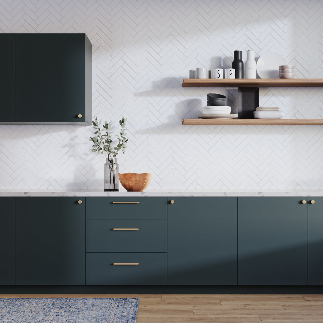
Green Kitchen Colours - Nature's Calm
Best for: Families wanting a grounding, organic feel that connects indoor and outdoor spaces.
Deep emerald creates drama without darkness, while muted sage offers serenity that works with natural wood finishes. Earthy olive tones provide warmth that feels both current and timeless. Green kitchens pair beautifully with brass hardware and natural textures.
Blue Kitchen Schemes - Fresh and Timeless
Best for: Creating crisp, clean spaces that feel calm but not cold.
Cobalt makes a bold statement when balanced with white worktops, while teal adds personality without overwhelming. Powdery blues work particularly well in smaller kitchens, reflecting light while adding gentle colour. Pair with blonde wood to keep the feel fresh and contemporary.
Neutral Kitchen Palettes - The Flexible Foundation
Best for: Families who love changing accessories and want colours that adapt to different styles.
Creams offer warmth without the starkness of pure white, while soft greys provide sophistication that works with any accent colour. Off-whites create brightness without the clinical feel, and they're forgiving of the inevitable scuffs and marks of family life.
Choosing Colours for Your Kitchen Size and Layout
Your kitchen's dimensions and natural light dictate which kitchen colour ideas will work best. Small kitchens benefit from light, reflective colours, but pure white can feel sterile. Instead, try pale blue-grey or soft mint, colours that open up space while adding personality.
Open-plan kitchens need colour flow between zones. Carry a shade from your living area into the kitchen, perhaps 10% lighter or darker for subtle definition. Large kitchens can handle bolder contrasts, dark lower cabinets with light walls, or a statement island in a complementary colour.
Traditional vs Modern Colour Approaches
Traditional kitchens suit heritage colours, deep blues, warm creams, and gentle sages that reference the past without feeling dated. Modern kitchens thrive on contrast: charcoal cabinets against white walls, or bold navy islands in light, airy spaces.
The 60:30:10 rule keeps any scheme balanced: 60% main colour (walls or cabinets), 30% secondary (the other major element), and 10% accent (hardware, stools, artwork). This formula works whether you're going bold or keeping things neutral.
How Lighting Affects Kitchen Colours
North-facing kitchens receive cooler, consistent light that can make colours appear muted. These spaces benefit from warm tones, creams, soft yellows, or pale peaches that add the warmth natural light doesn't provide. South-facing kitchens get abundant warm light and can handle cooler blues and greens without feeling cold.
Artificial lighting temperature matters as much as natural light. Warm bulbs (2700-3000K) soften cool colours and enhance warm ones, while cooler bulbs (4000K+) can make warm colours appear washed out but sharpen blues and greens.
| Light Direction | Natural Light Quality | Best Colour Families | Colours to Avoid |
|---|---|---|---|
| North-facing | Cool, consistent, softer | Warm whites, creams, soft yellows | Cool greys, stark whites |
| South-facing | Warm, abundant, changing | Blues, greens, cool neutrals | Overly warm tones |
| East-facing | Bright mornings, cooler afternoons | Versatile, most colours work | Very dark shades |
| West-facing | Warm afternoons and evenings | Cool tones, balanced neutrals | Overly warm yellows |
Light Testing Protocol: Swap your bulbs for different temperatures (2700K vs 4000K) for one week before finalising your kitchen colours ideas. Note how each affects your chosen palette at breakfast, lunch, and dinner times.
Family-Friendly Kitchen Colours: The Roomix Approach

Real family kitchens need colours that work with sticky fingers, homework sessions, and daily chaos. Our custom-made furniture uses FSE-approved wood and finishes that are completely free from nasty chemicals, safe for curious toddlers and busy families. Every piece is built to order by our expert joiners, so your kitchen colours ideas can be perfectly matched to your chosen wood finishes and hardware.
Unlike mass-produced furniture that limits your colour choices, our made-to-order approach means any shade can be expertly applied to your cabinets, shelving, or kitchen islands. Our finishes are designed to look better with age, developing character rather than showing wear. Spills wipe clean easily, and minor scuffs can be touched up without replacing entire pieces.
Durable Finishes That Actually Work
Best for: Families who want beautiful colours that withstand real life without constant maintenance.
Our expert joiners apply multiple thin coats rather than single thick layers, creating depth and durability. Each finish is tested against common kitchen hazards, from tomato sauce to felt-tip pens. The result is colour that stays true and surfaces that clean up easily, even after years of family life.
We offer colour matching services for any existing palette, ensuring your new Roomix pieces integrate seamlessly with your current kitchen. Simply send us a paint swatch or photo, and our joiners will create a perfect match in a finish that's built to last.
Adding Accent Colours Without Overwhelming Your Space
Accent colours bring personality without commitment. Start with easily changeable elements, tea towels, artwork, or a single open shelf painted in a bold shade. If you love the result after living with it for a month, expand to larger elements like bar stools or a feature cabinet.
The key is restraint. One strong accent colour per kitchen prevents visual chaos. Choose locations where the colour makes sense functionally, a bright backsplash that's easy to clean, or colourful lower cabinets that hide scuffs better than upper ones.
Hardware offers the subtlest way to introduce new tones. Brass handles warm up cool colour schemes, while black hardware adds sophistication to neutral palettes. Our custom furniture includes hardware selection, so your accent colours coordinate perfectly with cabinet finishes and wood tones.
Accent Strategy: Use our colour matching service for a single element, perhaps open shelving in a bold shade. If it works, we can apply the same finish to additional pieces as your confidence grows.
Painting Kitchen Cabinets: A Step-by-Step Guide
Proper preparation determines success. Clean all surfaces with sugar soap, sand lightly to create adhesion, and fill any dents or scratches. This prep work takes 60% of your total time but ensures professional results that last years, not months.
Choose moisture-resistant primer and paint specifically designed for high-traffic areas. Our expert joiners recommend applying multiple thin coats rather than fewer thick ones, each thin layer bonds better and creates smoother, more durable coverage.
If you're looking for a comprehensive guide, check out our article on painting kitchen cabinets for step-by-step tips and expert advice.
Professional Painting Timeline
Day 1: Remove doors and hardware. Clean, sand, and fill all surfaces. Allow repairs to cure overnight.
Day 2: Apply primer in two thin coats, four hours apart. Use a high-quality brush for panel details and a mini roller for flat surfaces.
Day 3: Apply first paint coat. Wait six hours, then apply the second coat. For high-use areas, add a third coat the following morning.
Day 4-5: Allow 48 hours curing time before reinstalling doors and hardware. Patience here prevents chips and marks during reassembly.
Roomix Colour Solutions: DIY with Professional Results

Our wall panelling and shelving kits arrive pre-finished in your chosen colour, eliminating the guesswork of DIY painting. Each piece is crafted by our expert joiners to your exact specifications, ensuring perfect fit and finish every time.
The beauty of our approach lies in the customisation options. Choose from natural wood finishes that complement any kitchen colours ideas, or opt for painted finishes in colours that match your chosen palette perfectly. Our colour matching service means your shelving and panelling integrate seamlessly with your overall design.
Professional Tip
Order sample blocks in your chosen finish and test them with everyday kitchen challenges, olive oil, tomato sauce, even a marker pen. Leave for 24 hours, then clean. Our FSE-approved finishes are designed to handle real family life, not just look good in photos.
Installation takes a weekend, not weeks. Clear instructions, pre-drilled holes, and all fixings included. No tradespeople needed, no mess, no stress. Just the satisfaction of creating something beautiful that's built to last.
For more inspiration on how to upcycle and refresh your kitchen, read our guide on how to upcycle old kitchen cabinets.
Colour Trends vs. Timeless Choices: Getting the Balance Right
The temptation to follow every colour trend can leave you with a kitchen that feels dated within months. Bold colours can look stunning in magazines, but living with electric orange or neon green daily is a different story entirely.
Smart families choose neutrals with personality as their foundation. Think greige instead of stark grey, warm white instead of clinical white, or sage green instead of bright lime. These colours have staying power because they're rooted in nature rather than fashion cycles.
When you do want to embrace current trends, do it through accents. A trending colour on tea towels, artwork, or a single open shelf can be changed easily when your tastes evolve. This approach lets you stay current without committing to expensive overhauls.
Take photos of your kitchen annually. Notice what still feels fresh and what makes you cringe. Colours that consistently please you year after year are the ones to build your palette around.
Quick-Fix Solutions for Common Kitchen Colour Problems
Even well-planned kitchen colour ideas can encounter challenges once you're living with them daily. Here's how to troubleshoot the most common issues without starting from scratch.
Making Small Kitchens Feel Larger
If your kitchen feels cramped, avoid the pure white trap. Instead, use light colours with subtle warmth, pale blue-grey, soft cream, or gentle green. These colours reflect light without the sterile hospital feel of stark white.
Add a glossier finish to walls and consider reflective elements like metallic hardware or glass-fronted cabinets. The key is creating depth, not just brightness.
Tackling Poor Natural Light
North-facing kitchens need warm undertones to compensate for cooler light. Avoid pure greys or blues, which can feel cold and unwelcoming. Instead, choose colours with yellow or pink undertones, think mushroom instead of grey, or cream instead of white.
Before repainting, upgrade your lighting. Sometimes a warmer bulb temperature (2700K instead of 4000K) or additional under-cabinet lighting transforms the space more effectively than new paint.
| Problem | Quick Fix | Long-term Solution |
|---|---|---|
| Kitchen feels too small | Add under-cabinet lighting | Light walls with subtle warmth |
| Colours look different than expected | Change bulb temperature | Test samples for 72 hours first |
| Too much contrast | Add neutral accessories | Introduce wood tones to soften |
| Feels cold and unwelcoming | Add warm textiles | Choose colours with warm undertones |
When Colours Don't Work Together
If your colour scheme feels chaotic, introduce more neutral elements. Wood tones, white, or soft grey can separate competing colours and create visual breathing space. Sometimes the solution isn't changing colours, but adding balance. For more on the psychology behind colour choices, see this overview of colour psychology.
Creating Colour Schemes That Work for Real Families

The most beautiful kitchen ideas colour schemes mean nothing if they can't handle the reality of family life. Sticky fingers, homework sessions at the kitchen table, and the inevitable spills are part of daily life, not design emergencies.
Choose colours that age gracefully rather than showing every mark. Mid-tone colours, not too light, not too dark, are most forgiving. Think soft sage, warm grey, or gentle blue rather than pure white or deep black.
Consider how colours affect mood during different activities. Warmer tones encourage lingering over breakfast and homework help, while cooler tones can feel more energising for morning routines. The best family kitchens balance both.
Our custom approach means you can adapt colours to your family's specific needs. Lower cabinets in slightly darker, more practical shades with lighter uppers to maintain brightness. Or vice versa, whatever works for your lifestyle and space. For more tips on improving your kitchen space, visit this kitchen improvement resource.
Your Kitchen Colour Journey: Where to Start
The best kitchen colours ideas start with understanding your space, your light, and your family's needs. Begin with the largest surfaces, walls and main cabinets. Build your palette from there, layering in accent colours and finishes that reflect your family's personality and daily routines. Remember, the most successful kitchens are those that feel welcoming, work hard, and grow with your family over time.
Frequently Asked Questions
How to choose a color scheme for a kitchen?
Start by considering the natural light and size of your kitchen, as these affect how colours appear throughout the day. Choose a base of soft neutrals for flexibility and durability, then add accent colours that reflect your family’s personality without overwhelming the space. Test paint samples on different walls and observe them at various times to ensure the colours work with your lighting and daily routines.


